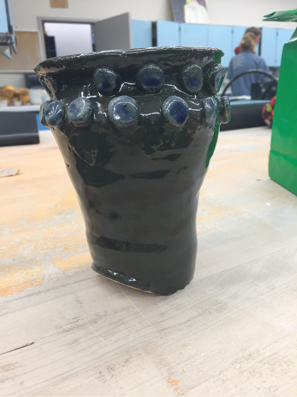
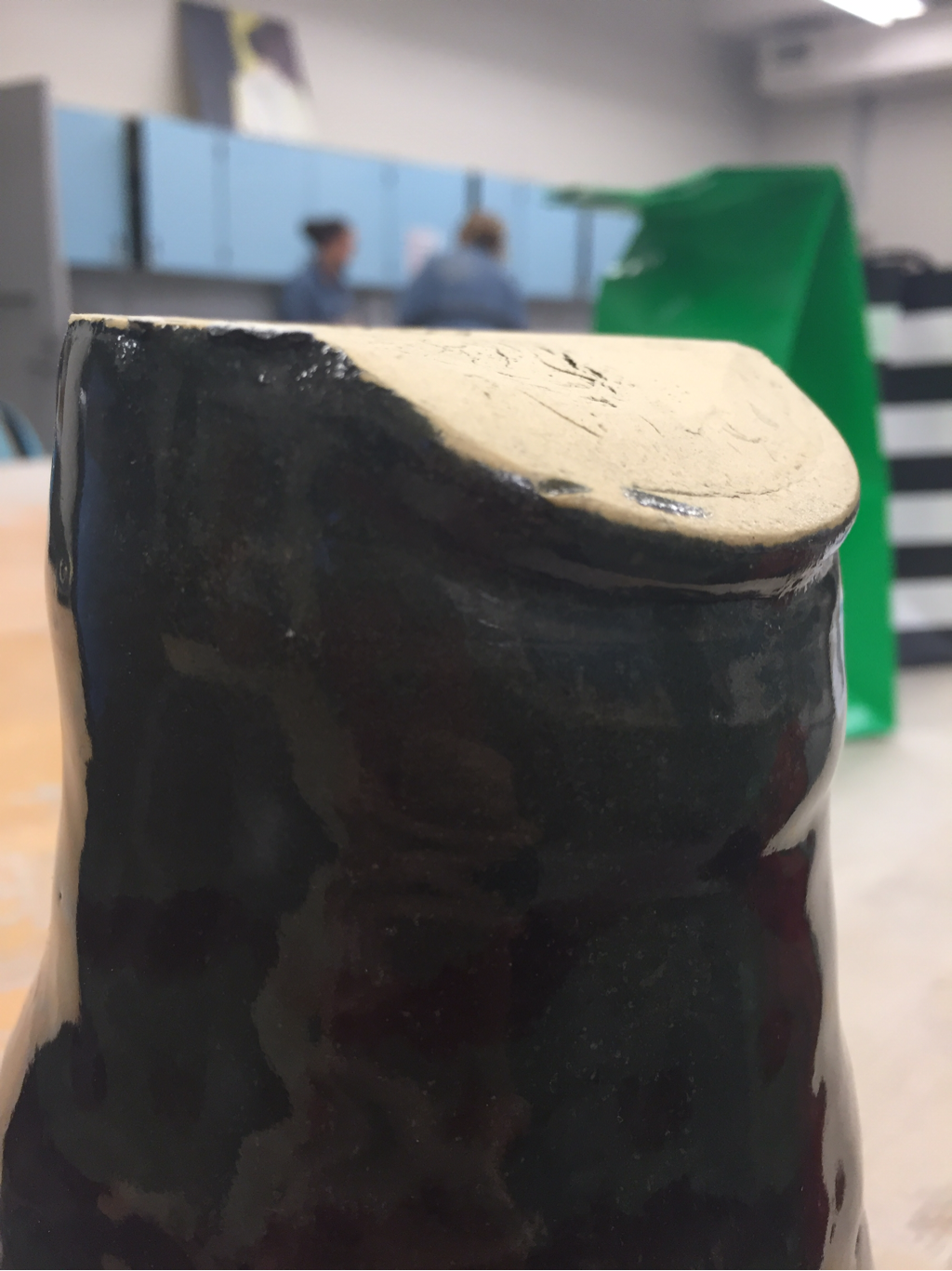
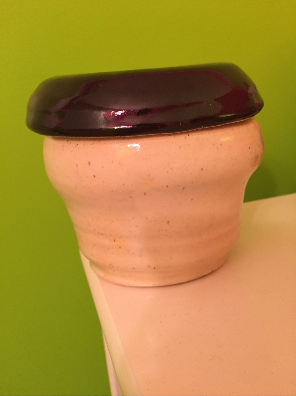
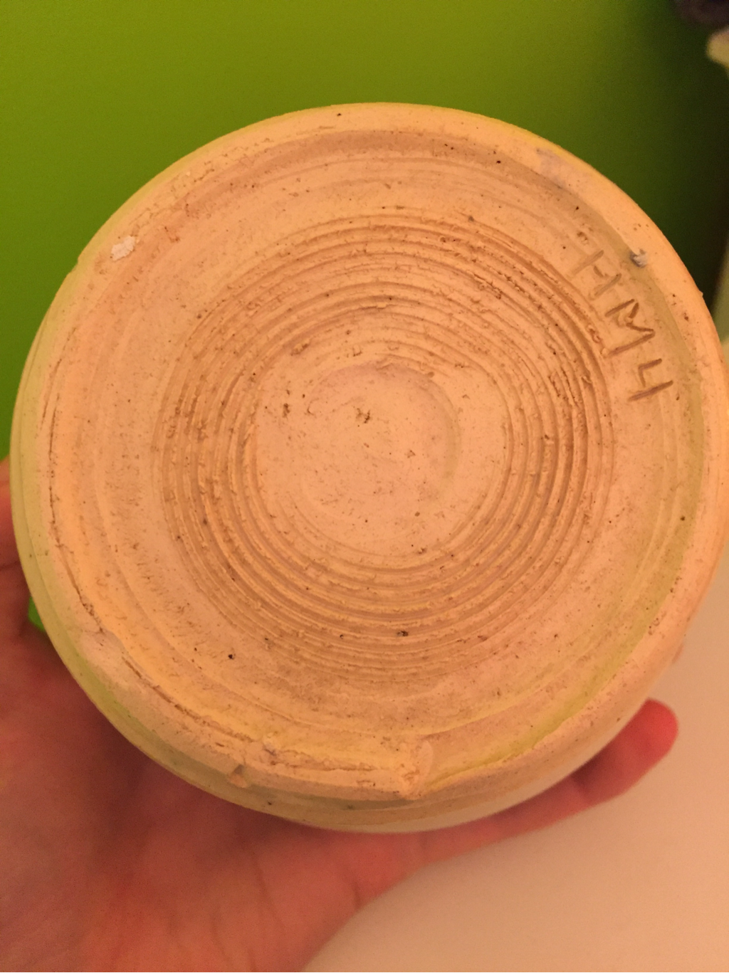
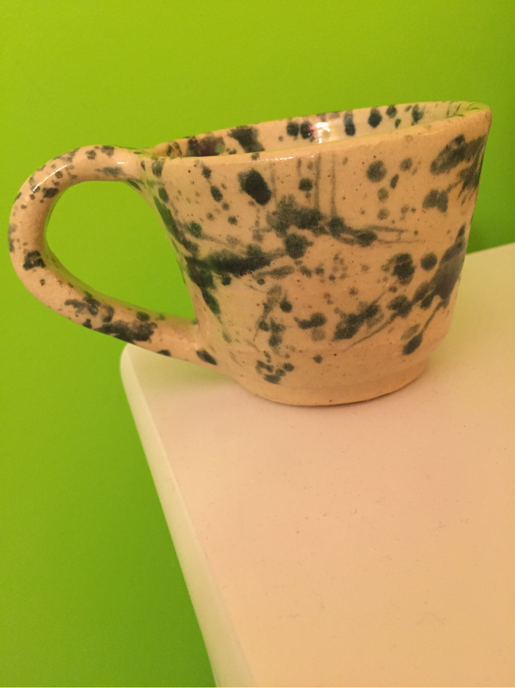
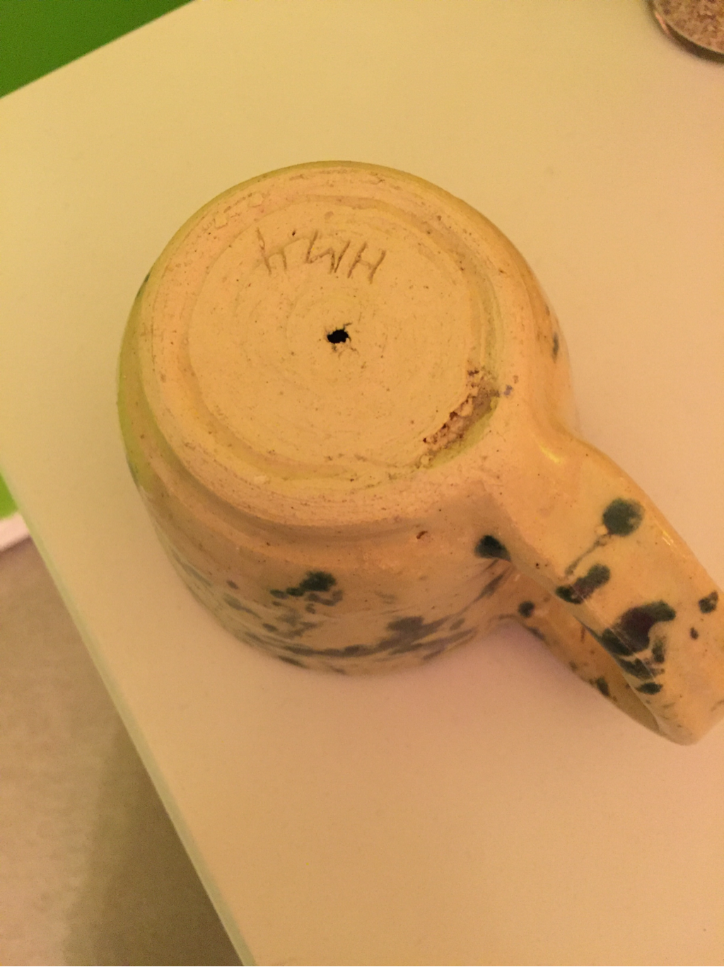
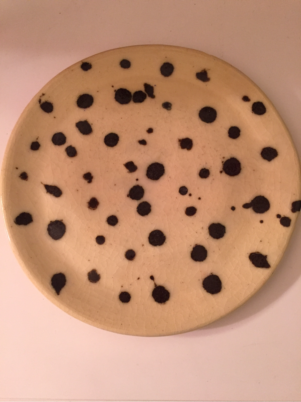
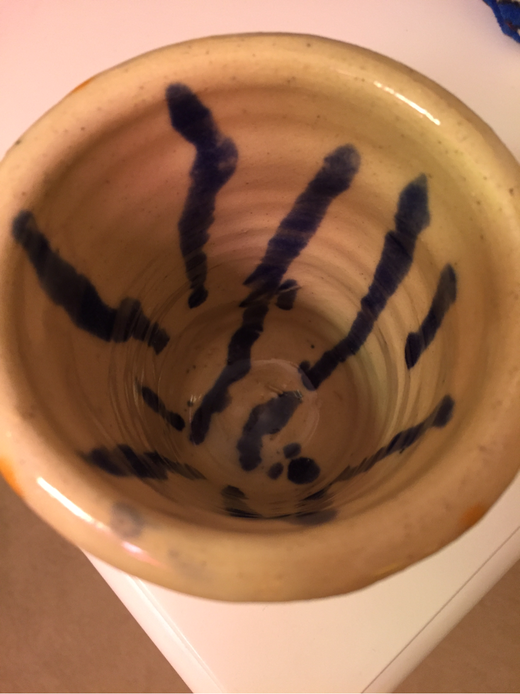
This project did not go as planned. Michael didn't make the top piece wide enough to fit the middle fit, so there are major cracks in the top of our project. The project also is leaning to one side because our pieces are leaning different ways. We decided to put circles of clay on the top of our project to hide the cracks. Unfortunately, I dropped the project when it was wet, and there is a huge dent on the bottom of the project. My favorite part of the project is the green glaze of the body contrasting the blue circles on the top.
This is a choice bowl that I made early in the beginning of the year. I forgot that it was in my locker. I decided to do something different with my glaze this time by using tape to add texture, but it didn't turn out how I wanted it to in my mind. It looks very amateur and not like the projects I usually make. I added purple and yellow to add a pattern elelemt, but it is pretty faint on the actual project. Next time, I need to paint several coats of glaze on my projects so that they stand out and look more professionally done.
This is my lidded project. It did not turn out how I wanted it to. The base of my project is a lot wider at the top, which made it difficult to make a lid wide enough to sit on top. Also, the lip of my project was uneven, resulting in the kid sitting at a weird angle on my project. My footing job was poor as well. I should have smoothed out the foot ring more. I do like the contrast on my project between the white and the black. I definitely need more practice making lids for projects.
This is my cup with a handle. There are a lot of things I could have done better on this project. I left the cup in the bag too long so it was dry and hard to attach the handle. Also, when I was footing, I cut too deep and made a little hole in my foot ring. Because of this, I can't use the cup practically. I am pleased with the glaze though, the splatter effect gives it an abstract pattern.
These are my two plates. I made them generally the same size, but I wanted the glaze to look very different. One thing that I noticed when the white and black one came out of the kiln was that the sides were uneven. When making plates in the future, I need to make sure that before I string it off the vat that the lip of the plate is an even height all around the plate. I am very please with the glazes of these projects; the clear glaze and black glaze provide a nice pattern with each other, and the orange and green glazed one is a good example of color contrasting sharply against one another.
This is my Tall Project. I decided to make it have a sort of base shape with a wide lip, and when I finished throwing it, I decided to use a pin tool to add texture. I spun the wheel, and placed the pin tool in the clay to make lines circling my project. With the glaze, I wanted it look like drops of color coming down the side to add design, but the color came out very faded. For the inside, I used a dropper and dripped blue paint from the top to the bottom. Next time, I need to use a darker color glaze on top of my clear glaze.
|
AuthorWrite something about yourself. No need to be fancy, just an overview. ArchivesCategories |