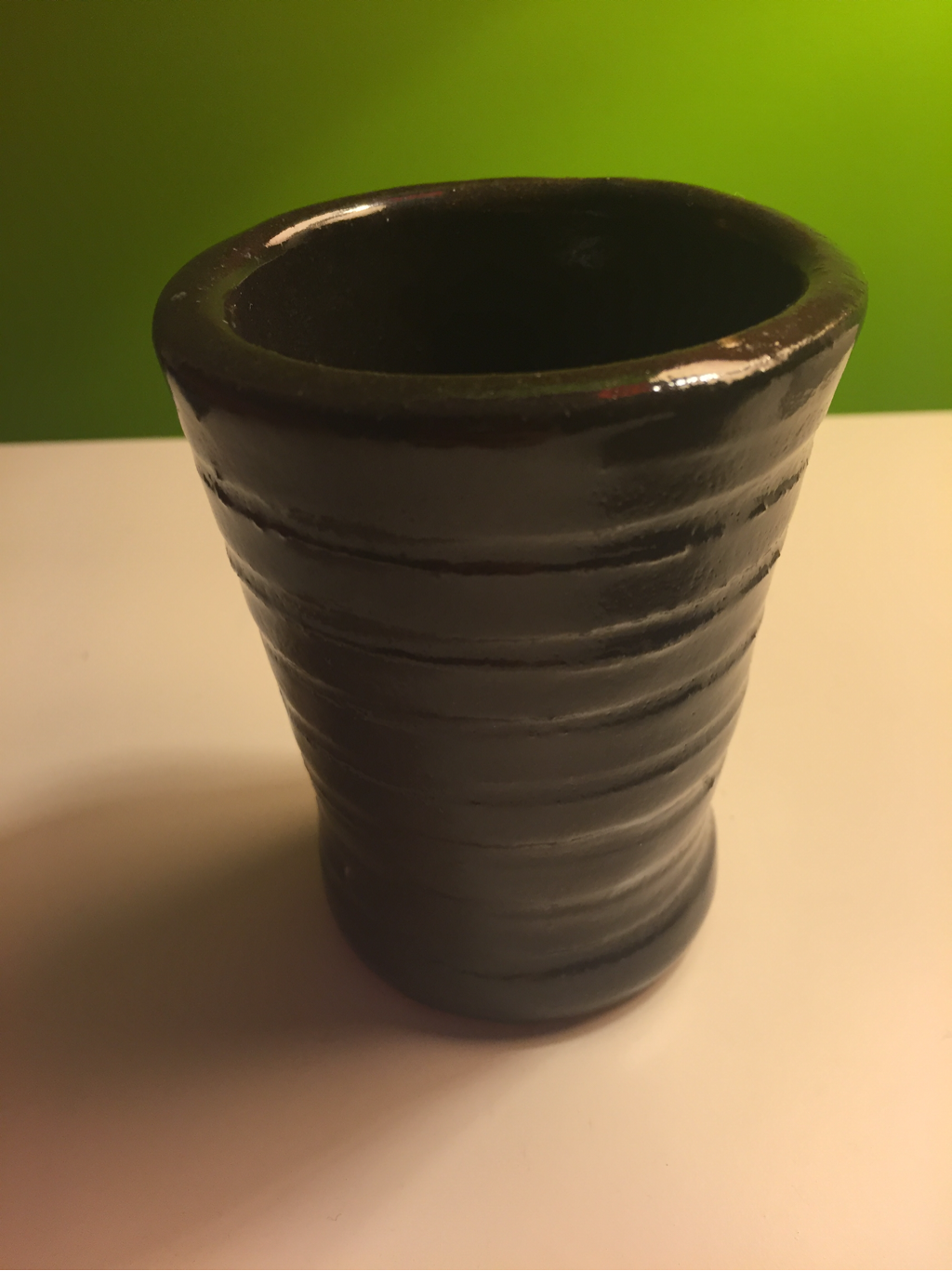
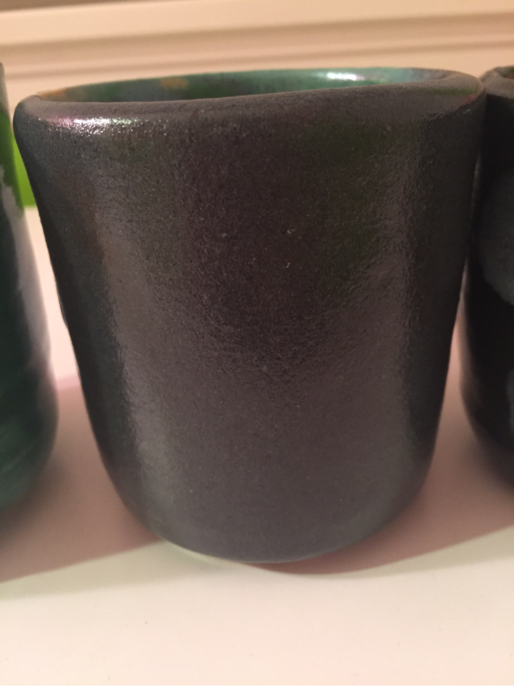
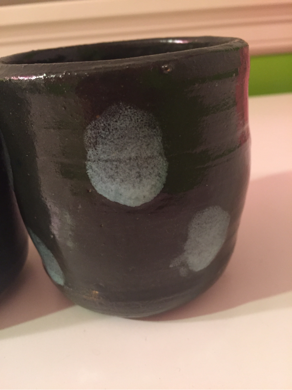
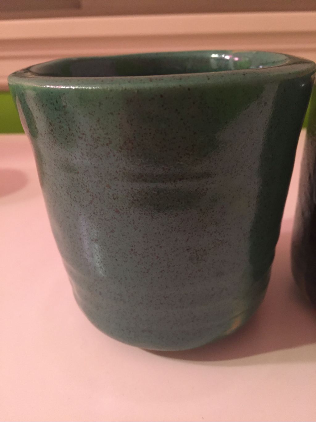
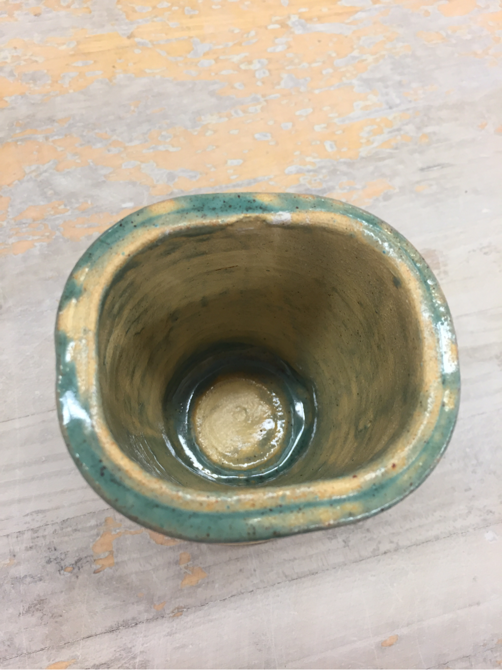
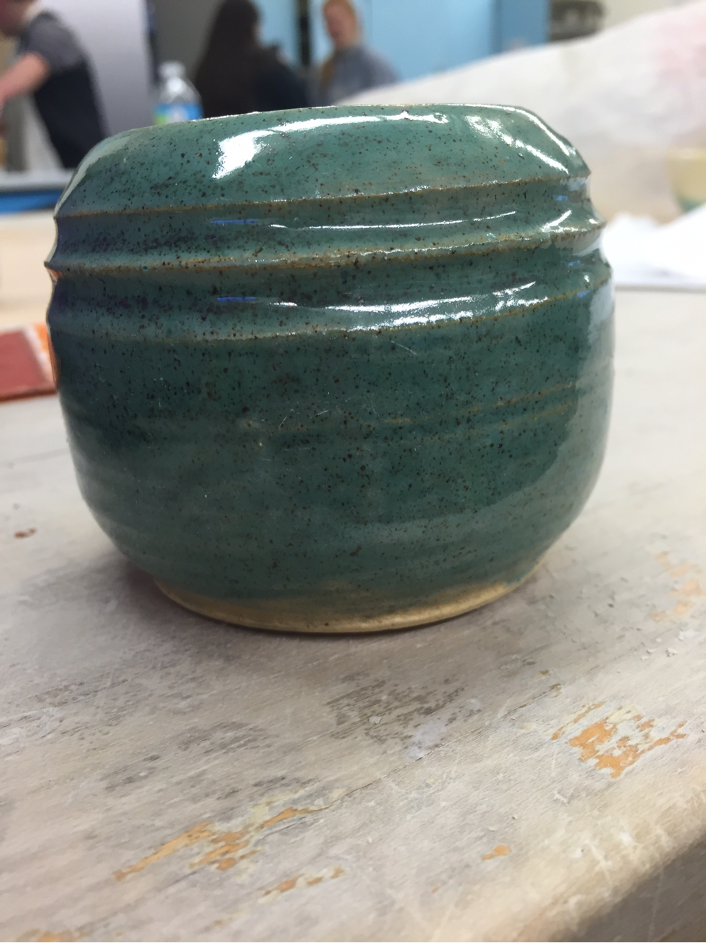
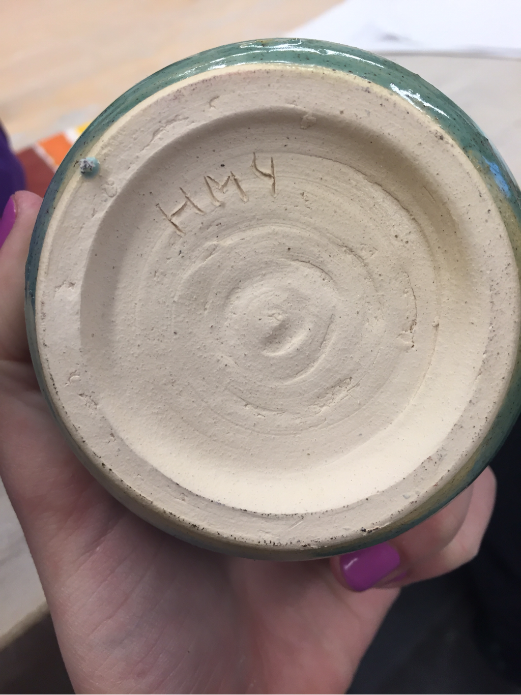
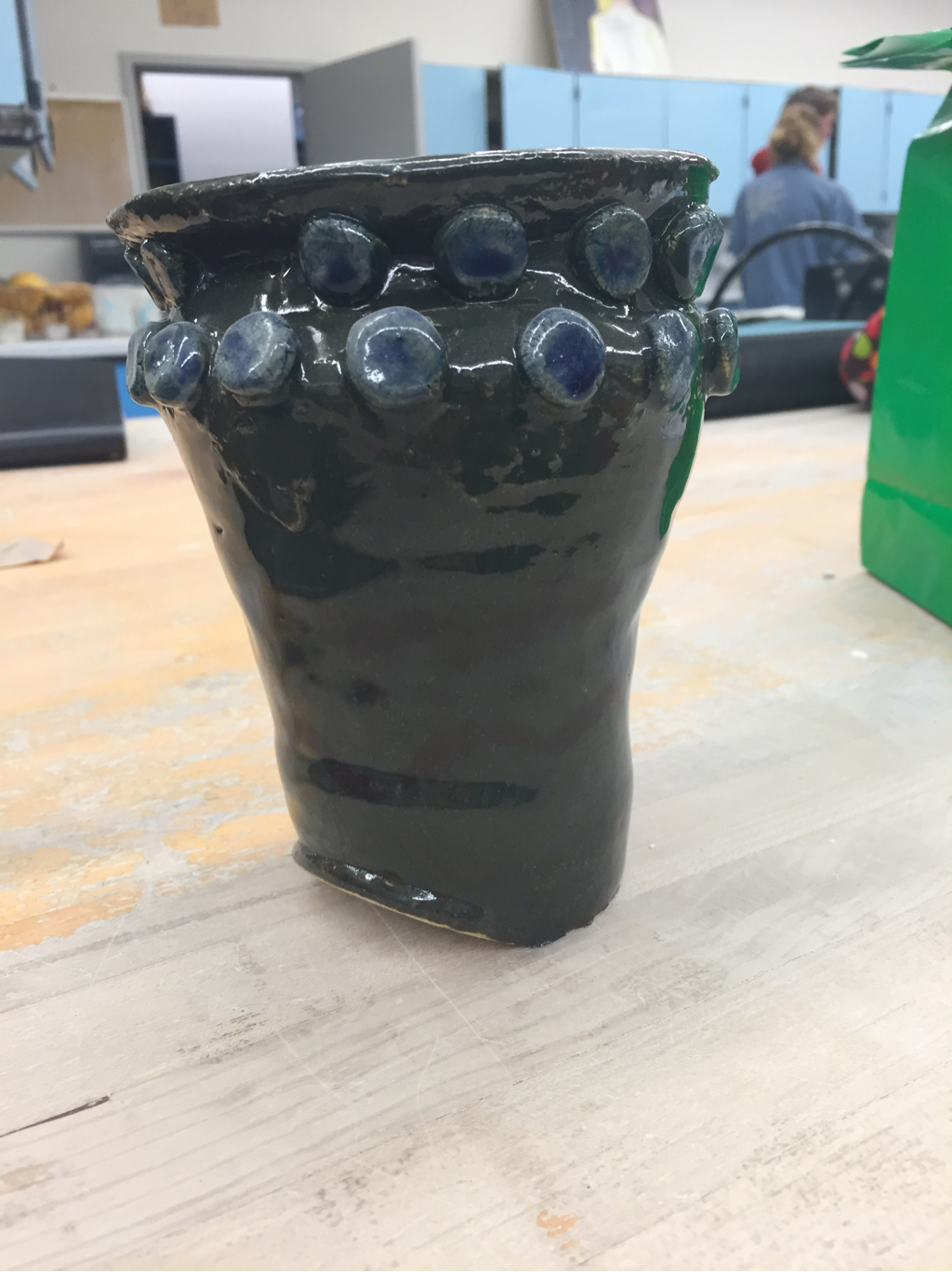
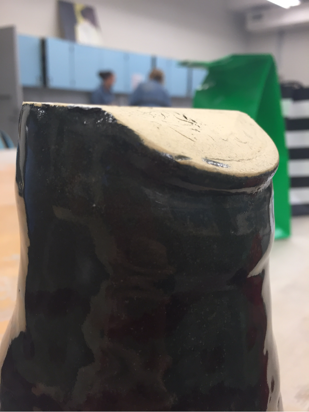
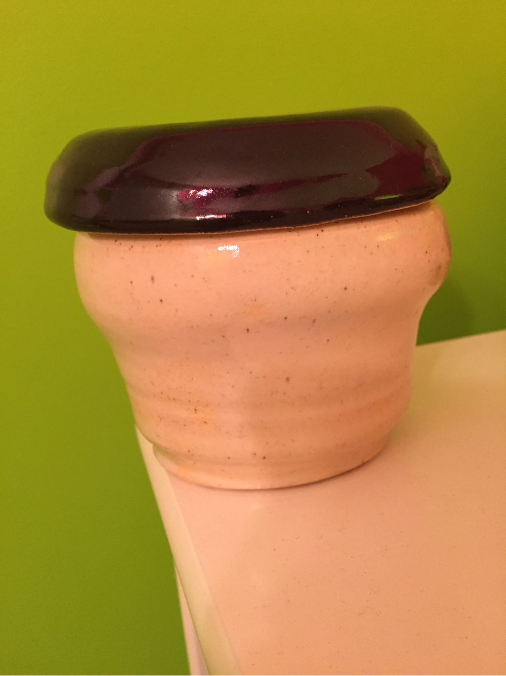
This is my third choice cylinder, yet I think this is the only choice cylinder I made that stands more than 3 inches tall. To add texture to this project, I decided to use a footing tool and create rings around the outside. These rings give the project emphasis. I wanted to paint the rings individually, but I didn't have time. I settled for dipping the entire project in midnight oil. Next time, I want to use tools more often to create texture in my projects.
This is my first choice bowl. I decided to something interesting with the glazing this time around. I dipped half of it in midnight oil, half of it in deep cobalt blue, then in the very middle painted seafoam green. The seafoam didn't turn out as well I had hoped, but I like the way that this project has a certain contrast and balance to it with the 3 coots intertwining. I plan on overlapping glazes much more often.
This is a tall choice project that I made. For this particular project, I really wanted to make sure that the walls of my project were brought up evenly and that I pulled enough of the clay from the bottom so that my bottom wouldn't be too heavy. I really like the way the splatter effect works so again I dipped the project into white glaze and then used a dropper to drop forest green dots all around the outside of the project. This provides contrast and an interesting movement because it reminds me of raindrops.
These three cylinders make up my set of three. It was hard for me to make identical projects, so I decided to make each one a little wider and taller than the one before it. For the glazing, I used blues and whites to create a more earthy, neutral mood. I am proud of these projects because my lips are even. I really focused on shape for this assignment, yet I think I could've done something more creative with the glazes.
This is my wheel altered project. I threw a cylinder and then I made the lip into a square shape. I left it on the vat for too long so I couldn't complete a foot ring because the clay was too dry. I painted on blue glaze but I only painted on one coat so the glaze is very spotty and definitely not thick enough. I wish I would've taken the time to paint another layer of blue glaze on.
This is another choice I made. I modeled it to look like my previous choice project, but I used a tool to make two rings around the top of the project to add texture. I dunked the project in the green glaze, but I wish I would have made sure the glaze was thick enough because I can see spots where the glaze didn't get evened out. I plan on using this choice to hold pens and pencils!
This is one of my extra projects. I decided to start with a small cylinder and then see if I could turn the lip inward to make it a rounded project.
For the glaze, I wanted to do a contrast between white and burnt orange, so I dipped it in white and then haphazardly painted orange blobs into it. I am very proud of this footing job, I think I have really improved on my skills to foot. This project did not go as planned. Michael didn't make the top piece wide enough to fit the middle fit, so there are major cracks in the top of our project. The project also is leaning to one side because our pieces are leaning different ways. We decided to put circles of clay on the top of our project to hide the cracks. Unfortunately, I dropped the project when it was wet, and there is a huge dent on the bottom of the project. My favorite part of the project is the green glaze of the body contrasting the blue circles on the top.
This is a choice bowl that I made early in the beginning of the year. I forgot that it was in my locker. I decided to do something different with my glaze this time by using tape to add texture, but it didn't turn out how I wanted it to in my mind. It looks very amateur and not like the projects I usually make. I added purple and yellow to add a pattern elelemt, but it is pretty faint on the actual project. Next time, I need to paint several coats of glaze on my projects so that they stand out and look more professionally done.
This is my lidded project. It did not turn out how I wanted it to. The base of my project is a lot wider at the top, which made it difficult to make a lid wide enough to sit on top. Also, the lip of my project was uneven, resulting in the kid sitting at a weird angle on my project. My footing job was poor as well. I should have smoothed out the foot ring more. I do like the contrast on my project between the white and the black. I definitely need more practice making lids for projects.
|
AuthorWrite something about yourself. No need to be fancy, just an overview. ArchivesCategories |